Responsive Web Design Tools, Techniques, Templates and Frameworks
The need for excessive on the go mobile browsing, and an excessive amount of devices now allow for a responsive web design corresponding with the website. Web designers and web developers today have to design websites that are functional across multiple screen resolutions. That means websites should be available for browsing on smartphones, tablets, netbooks, or standard monitors, without losing their screen resolution, according to the user’s screen size. Multiple viewing mediums have certainly made the job a tad more difficult for the modern web designer.
A responsive web design will ideally allow the website to be viewed and respond according to the medium that is being used to view it, so for example if a user is browsing the website on a 320px smartphone, or 768px or 1024px tablet, or a 1680px netbook or monitor, it will respond and look the same way. So, how do you go about designing a responsive web design? Well, designers today use fluid widths in percentages and ems, scalable images and adjustable layouts depending on the browser size, so the website will look and feel the same way if it is viewed on an iPhone, or iPad, or a laptop or a tablet or a computer monitor.
Go through following responsive web design tools, techniques, templates and frameworks and find out all about responsive web design.
Responsive Web Design Examples
Before you go through with tools, techniques, templates and frameworks we want you to look at these responsive web design examples.
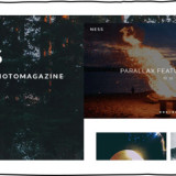
Simon Collison

Andersson-Wise Architects

Food Sense

Naomi Atkinson

Forefathers Group

Spigot Design

Arrrrcamp Conference

Splendid

El Sendero del Cacao

Do Lectures

Naomi Atkinson Design

Alsacréations

Tools and Techniques
Following are the tools and techniques that helps developing a responsive website a whole lot easier.
FitText
FitText makes font-sizes flexible. Use this plugin on your fluid or responsive layout to achieve scalable headlines that fill the width of a parent element.

Responsive Design Testing
Test your own site… type the url and hit enter.

Resize My Browser
It helps you to resize your browser window in a certain window size. You just need to click on the size you need and find out how your site look like. It doesn’t work in Chrome and Opera due to issues with “ResizeTo” event.

Fluid Grids
A fluid grid calculator to build your own fluid grid systems.


Responsive Web Design Sketch Sheets

Adobe Device Central CS5.5
Adobe® Device Central CS5.5 software simplifies the production of innovative and compelling content for mobile phones, tablets, and consumer electronic devices.

Templates and Frameworks
Following are very useful and handy responsive web design templates and frameworks.
Mobile Boilerplate
Mobile Boilerplate is your trusted template made custom for creating rich and performant mobile web apps. You get cross-browser consistency among A-grade smartphones, and fallback support for legacy Blackberry, Symbian, and IE Mobile. You get an offline caching setup for free, fast button clicks, a media query polyfill, and many common mobile WebKit optimizations waiting for you. Use Mobile Boilerplate to start your mobile webapp quickly and immediately benefit from community best practices.

Skeleton
Skeleton is a small collection of CSS & JS files that can help you rapidly develop sites that look beautiful at any size, be it a 17″ laptop screen or an iPhone.

Hardboiled CSS3 Media Queries
These hardboiled CSS3 Media Queries are empty placeholders for targeting the devices and attributes.

Tiny Fluid Grid
The happy & awesome way to build fluid grid based websites.

FluidGrids
A CSS framework for rapid interactive prototyping.

Less Framework
Less Framework is a CSS grid system for designing adaptive websites. It contains 4 layouts and 3 sets of typography presets, all based on a single grid.

CSS Grid
The 1140 grid fits perfectly into a 1280 monitor. On smaller monitors it becomes fluid and adapts to the width of the browser.

inuit.css
inuit.css is built to work on smaller screens (such as tablets) and tiny screens (such as phones) straight out of the box with minimal effort.

Flurid
A cross-browser CSS grid framework that doesn’t hide pixels in margins!

320 and Up
‘320 and Up’ prevents mobile devices from downloading desktop assets by using a tiny screen’s stylesheet as its starting point.

Articles and Publications
Following are concept-level discussions of responsive web design that will help you understand better about responsive web design.
A Brief Overview of Responsive Design
A very useful article by 1st Web Designer that helps you understand what is responsive web design and how you can achieve this.

Understanding the Elements of Responsive Web Design
A very useful article to understand the elements of responsive web design by six revisions which covers flexible grid, flexible images, and media queries.

Responsive Web Design: What It Is and How To Use It
This introduction to responsive design from Smashing Magazine covers the basic concept, as well as practical concerns for creating responsive designs.

Responsive Web Design
This article guides you with best practical practices and techniques that are behind responsive web design.

Beginner’s Guide to Responsive Web Design
Introduction to responsive web design including fluid grids and media queries.

CSS3 Media Queries
You can have one stylesheet for large displays and a different style sheet specifically for mobile devices. Continue with this post to read the tutorial and see some websites that make good use of media queries.

Experimenting With Responsive Web Design
A simple overview of responsive design, particularly media queries and some responsive web design examples.

Designing for a Responsive Web
This articles covers three aspects of responsive web, such as fluid grid, fluid images, and media queries.


Really interesting article. A great collection of responsive
web designs tools.Responsive design continues to get a lot of attention and is
remarkably different from traditional designing in terms of technical and
creative issues.Thank you so much for this fine piece of quality content.