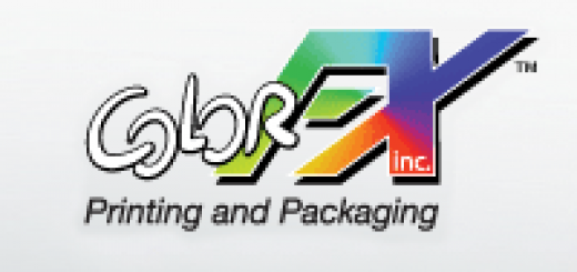
Designing Logos: A Few Thoughts About Typography
The road to creating a new logo can often be long and hard. There are several things to think about when designing a logo, and one of the most important is deciding on a good typeface. We don’t want you to get in a funk about fonts, so we’ve put together a few simple lessons to make sure you get the right message across to your customers.

Typefaces

Your logo’s font should be neat, sleek and well thought out. It’s also got to be memorable, appealing to the eye and relate strongly and clearly to your brand, company or product.
As a designer, you are sure to love experimenting with typefaces, but when you are designing your logo, try not to incorporate more than two fonts. Using too many typefaces in one logo will result in a loss of coherence. But using just two fonts can help to create a good contrast that catches the eye.
Keep It Simple

As someone with an artistic and creative flare, you might have the urge to create a flamboyant, complex design. However, if you make your logo’s font too complicated it can be difficult to read and interpret which defeats the whole point. You want your audience to simply glance at your logo and understand it. If they have to peer at it closely to work out what it’s supposed to say, scrap it and start again.
Make It Adaptable

Try find or and design a font that can be adapted to any type of media or surface. In addition, make sure your design works well in any size, whether it’s on a billboard or on a website when looking at it from an iPhone or netbook.
Font For Thought
Before you design your font, think about the message you are trying to get across. Having a bold and chunky font communicates a strong-statement, whereas flowery and curly fonts are typically associated with female-focussed brands or even vintage artwork. It’s best to asses what you want the logo to say about you and your company, then choose a typeface accordingly.
Typography is essential in designing marketing prints because it contributes to the materials’ effectiveness and aesthetic appeal. Remember the tips above in your brochures printing to make your prints more attractive.