How to Avoid Worst Web Design
It’s not unusual for many people to leave disgusting websites and quickly switch over to a different one that is pleasurable to surf. Ironically the very purpose of websites is to retain viewers as long as possible and make them click. If you had come across such websites then you would realize that the flaw lies in the design of the website. So is the case with business brochures because the purpose of this marketing collateral is to make the reader focus on the subject and have an impact on the decision making capabilities of the potential client. If you are planning to launch a website for your business or print brochures then here are a few deadly mistakes that you should avoid while designing your website.
Designing a Quality Website
Here are some points which you should remember while designing a website.
Website Layout
First of all the width of your website should fit in the screen of the computer. Side to side scrolling is a very bad idea that will irritate a visitor. Especially if you are using flash templates or flash template layouts, this type of flaw will be very obvious. While it is all right to scroll a little up or down, width of the website should never exceed the standard screen sizes. Especially when it comes to homepage design experts recommend the even vertical length should be reasonable. One other solution to this problem has derived in the form of liquid layout designs which can adjust itself to the dimensions of the screen and make it compatible to various web browsers as well as the hardware used.
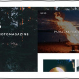
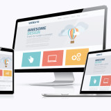
The Best Designs
Check out the following website for your reference that meets the standard design patterns:

Symmetry
Website should always be center aligned. It is true that academic papers are preferred when they are left aligned however; this does not work with websites or brochures. It provides an unprofessional look and is often considered as a flaw in design. Symmetry is considered to be the basic aspect of beauty. It is true in case of websites and templates. Center alignment provides the perfect look as desired by the visitors retaining them for a longer period in the website.
Backgrounds and Borders
Backgrounds and borders provide a great look to websites. A few who misunderstand the term simplicity often make the mistake of creating borderless design or completely avoid backgrounds that can be pleasant to the viewers. Backgrounds and boarders actually are eye catchy elements that attract the attention of the onlooker. Attracting the attention of the visitor within seconds is important in websites and brochures. You should leave no stone unturned to achieve this. However, overdoing them can as well distract the viewers and defeat the purpose. Hence moderate and attractive backgrounds and boarders are a plus to web design.
For instance: Useful Website Background Designs, Trends and Resources
Fonts
Often people scan through the websites and using obscure fonts might irritate them from scanning the textual content. Choosing a commonly available font can help you increase the readership. The size of the font also matters if you’re presenting a lot of minute details about your products and services. It is important to insist on fonts and sizes especially if you are using brochure templates or 3-fold flyer designs to create brochures. Template brochure monster meticulously avoids such grave flaw enabling in creation of perfect marketing collateral for businesses.
Navigation
Yet another flaw that shatters the performance of a website is the navigational flaw. All of the web pages should be available to the visitor within three clicks. If any of the important messages that have to be conveyed is unreachable within three clicks, then your website design is certainly working against your interests. Experienced web designers often make it a point that all of the vital links are present or accessible from the home page. Including a back button that enables the visitor to reach homepage from other pages is a good idea.
Clarity of Message
The most important of all is the clarity of message in the home page of the website or the cover page of the business brochure. Often people who concentrate on various design technicalities make the blunder of providing blurred messages that do not convey the purpose of the marketing collateral. This should be strictly avoided and the message should be made crystal clear. The use of techniques such as headings, sub headings, bullet points and italics can deliver the message effectively to the readers. Usage of images and promotional images are best known for its appealing looks that attracts more visitors.
Check out the following websites which doesn’t meet the standard design patterns:
Mrbottles

Petersbuss

Water on Wheels

Industrial Painter

Gates N Fences

Irish Wrecks

Ptbalirealestate

Mamascheesies

Your New


For clarity of message–hire a landing page copywriter who understands direct response copywriting.
Hey excellent post.Very useful guidelines are here for designing a good web page. To design a webpage successfully it is important to plan the page
layout and the content carefully.Thank you so much for this fine piece of
quality content.