Has Flat Web Design Become Dull?
In a response to the skeuomorphism that dominated web design at the beginning of the millennium, designer turned to flat web design. Skeuomorphism took inspiration from the real world, creating designed that mimicked the natural materials and designs of physical products in computer apps. Skeuomorphism in design meant the calculators and calendars found in PCs and laptops looked and functioned almost exactly the same as their physical counterparts.
As the digital revolution progressed, however, designers began to think differently about how apps should look and function. After all, digital apps didn’t have the physical limitations that products did: there was no reason why a calculator on a computer couldn’t use words or why a calendar had to have a fixed layout of squares.
Moreover, the details that made skeuomorphism so charming at first – the ragged edge of a torn page at the top of the calendar, or the spiral binding image on a notepad program – weren’t working well with new technologies. People began to access all websites from devices of all shapes and sizes, and responsive design was developed to cope with the increasingly varied sizes of screens and processing power of devices. Those skeuomorphic design elements slowed loading times and just looked silly on mobile phone screens, where the detail was lost because the screen was too small.
The answer was obvious to designers. They would simply stop looking to the real world for aesthetic and functional design inspiration. Instead, they would look at how people use apps and programs, and use that to inform the designs. This approach was called flat design, not least because it largely did away with the shadows and gradients that skeuomorphic design used to create 3D effects.
Flat design has answered a lot of the problems associated with skeuomorphism, but it is by no means perfect. Many have argued that flat design doesn’t resonate as quickly with users and that it can often make programs seem more difficult to learn as they don’t draw on real-world equivalents that people are already familiar with. Worse still, it can be boring.
So, is this true? Has flat web design become dull?
Accusation: Flat web design removes the personality of the design.
Flat design started as a design philosophy that is based in minimalism: that every part of a design that does not serve a direct function should be eliminated until form and function are practically indistinguishable. That means that every shadow, every gradient, every overlapping element that indicates depth, should be taken out.

Critics argue that this often leads to a lifeless, charmless design. Take, for example, the comparison of the old and new eBay logos. The new design stripped out the gradients and the suggestion of depth created by overlaying the letters, but it also took out the playful, relaxed feel of the old eBay logo.
Answer: It is secondary to functionality, but personality can still be in the design.
Flat design seems to work best for serious, straightforward or naturally minimalist designs. It is quintessentially functional and direct. For companies like Google and design templates like Microsoft’s Metro, it is important to be simple and easy to use. Personality is brought into the design later with striking colour palettes and geometric patterns.
Accusation: Flat design strips out so much that it is hard to use.
Whatever your aesthetic choices, skeuomorphic designs did make design hierarchy easy to establish. With shadows and gradients, those designs could easily direct the user’s eye to a button, a call to action or a field to fill in. When proponents of flat design did away with those elements, they through the baby out with the bathwater. Flat design is so flat that it is hard to know where to look first.
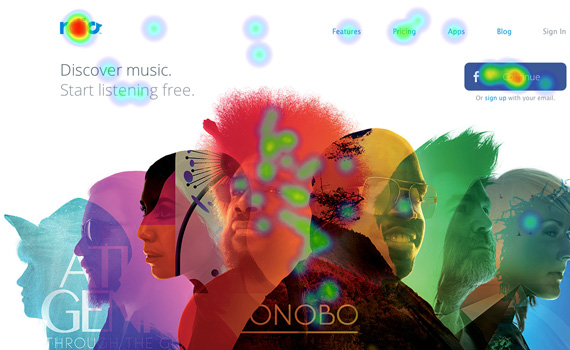
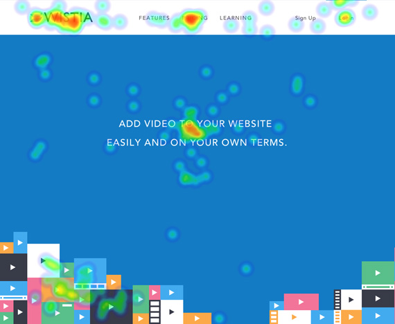
The first image above is a heat map showing where users’ eyes go when looking at a page that does not have a flat design. The second image is the same idea, showing where users’ eyes go when they look at a page with flat design.
In the first image, the dots which indicate where users’ eyes have fallen are clustered on the logo, the links at the top, the middle of the main image and the Facebook button. There are almost no dots anywhere else. In the second, dots are clustered in the main areas – the logo, the message in the middle of the page and a couple of the links – but they are also scattered all over the page like confetti.
The problem is clear: the flat design is so flat, users have no idea what to look at first or most, so they have no idea what this page wants them to do. This is indicated in their thoughts on the page: though they find the design clean and modern, they also think it is confusing.
Answer: It strips back but adds back in that which enhances user experience.
Even proponents of flat design have recognised this as a real pitfall to the philosophy. After all, a design is only as good as its ability to make users do something. In response, many designers have begun to incorporate some less-flat design elements, like light shadows and gradients, so that the eye is drawn to the elements the designer intends. This is done as unobtrusively as possible, of course, but it subtly guides the user to the right elements so the user doesn’t feel lost.
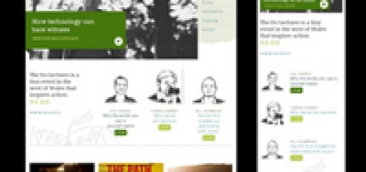
Accusation: It’s hard to look distinctive in the flat design world.
This is a two-part issue. First, anyone who has ever had a passing interest in design will notice that trends for colours and motifs spring up, and everyone uses them at the same time. Second, inspired as it is by the rationality and functionality of our digital devices, flat design will always prefer grids and rational layouts to less logical, but perhaps more emotive, designs. The design is made distinctive through colour and other design elements that can be applied to the design later in the process.
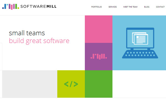
The first image above is for a software developer, and the second is for a designer. Although they provide very different services, their sites look remarkably similar.
This demonstrates that if flat design relies on colour and shape to be distinctive, yet everyone is drawn to the same colours and shapes at the same time, it becomes practically impossible to really stand out.
Answer: Good design has always needed skilled designers.
Skilled designers know how to give their design that little bit something extra – the thing that makes the design stand out. Perhaps they will use a slightly different shade of pink to others, or they might think of new ways to use standard things like grids and boxes.
The reason flat design can look so same-y is because the basic elements are so easy. You take some boxes, make them trendy colours, and – hey presto – you will have a modern, flat design. It takes a truly skilled designer to use that basic idea and elevate it with truly creative, unique ideas.
Conclusion
Flat design can be dull. It can be lifeless, hard to use and indistinguishable from other flat designs. But skeuomorphism was accused of the same things in its time, as was minimalism. The dullness now demonstrated in flat design is not a problem within flat design; it is a problem within design as a whole. Done well, any style of design can be breathtaking. Similarly, if it is not done with skill and creativity, no design style can transcend the dullness of the designer.
If flat design has become dull, it is only because it has become so popular that less-talented designers are doing it now, too. The good and the great will continue to create flat designs that are charming, easy to use, eye catching and anything but dull.