Landing Pages: Things to Think About Before Designing
There are so many elements to consider in an effective landing page that you might not know where to start. But a successful final product really comes down to a handful of concepts that fall under just a few categories. Do your business a favor by checking off these essential components of good landing page design.
Placement

Stay Above the Fold
Remember that users will only go below the fold on about 20% of webpages, so make sure that everything important—your title, explanatory statement, form, major images or videos, and definitely your call to action—is where they’ll be sure to see it.
Keep Forms Simple and Easy
You should never have more than one form, and that form should be quick, simple, and secure. Beyond that, some research shows that you might get a higher rate of conversion with forms that are placed on the left. This is probably because Western viewers take in a page from right to left, and they subconsciously feel that they’re being rushed into committing if the form is placed before the content.
Wording

Have A Unique Selling Point
One of the most important things to get across in your narrative is the sense that your product or service will have unique value for the user that they can’t get anywhere else. Your copy should explain what this is.
Be Concise
Strip your copy down to the barest minimum. Any excess whatsoever just detracts from your goal; that is, fast, effective delivery of your message.
Be Tempting
It’s difficult to strike a balance that makes every single sentence and phrase sound upbeat and appealing, but also sincere and trustworthy. And yet, that should be your goal. Common phrases in the call to action are simply “Submit” or “Click Here.” Rephrasing these as “Start your free trial” or “Receive the 50% off coupon” can make you sound more appealing.
Visuals

Make it scan-able
Web readers are notorious for skimming a page, so it’s a good idea to make it easy for them. Highlight words and phrases that you’d particularly like to call out, with bolder, larger, or different fonts. Break up paragraphs into manageable chunks.
Appeal to your audience
Every part of the visual experience, from the typefaces and illustration style, right down to the color scheme, should be based on the needs and preferences of your target audience.
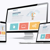
Use worthwhile visuals
There are two routes to go down when you decide what images to include in your landing page. The first is a visualization of your product or service in use; if this is something that can be clearly and attractively demonstrated, it’s a great way to go. If not, choose images that evoke your concept. Either way, the visuals should logically relate to the branding and the product.
After you’ve made all these decisions about your landing page, you might think that you’re in the clear. But the placement, color, size, and phrasing of the components in your landing page all have an effect on user experience, perceptions, and conversion. Keep in mind that the most effective landing pages have evolved over many iterations to work as well as they do. Tests and revisions are in your future, but with these tips, you’ll have a solid start to work from.


Hey Luke, This is really a great post. I am gonna create a site & confused about the visual part, but surely this will help me out.
If you can provide more links on the same than I would be thankful to you:)
Very good post thanks for sharing.
Arun Nair