Vintage and Retro Website Design Trend
Vintage and retro trend web design was once nonexistent on the web as a dynamic medium, however times have changed and numerous sites use the retro and vintage designs in a variety of contexts. Firstly and understanding of the difference in time period for the styles is needed – vintage is set between 1950-1980, retro between 1910 and 1930 – not sure what happened to the 20 years in between.
These website designs are exciting and can be combined with elements both old and new to give a page a very individual and stand out appeal. Old fashioned motifs, items and characters are commonly used – analogue devices such as radios with big dials and TVs of the same nature are also used. The aforementioned conveys emotions of nostalgia and awakens associative feelings of something better. This is called classic conditioning and is used to create a positive emotional response.
Vintage and retro combine a number of elements to make a successful site. Typography and fonts are commonly used to evoke these classic conditioning emotions and give a site a sense of identity that is set in either period. Old cars, consumer goods and packaging are also used, as are old photos – some of which are used with a sense of irony. The MacCarthyesque smiling faces of these 1960s and early 1960s photos can be used for post modern satire and irony and may designers use them to this effect.
Texture is also a very important part of the retro and vintage design work. Stamps and the uneven inky textures are often used, as are cotton paper like back grounds Torn paper and scrapbook like pages with photos also give a similar retrospective website impression. Old signs are also subject to the postmodern satire treatment. In later 1960s vintage styled pages pop art is also a very commonly used medium to convey messages while still maintaining the style of the time.
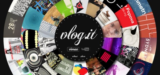
Circles are very commonly used in vintage and retro web design, unlike the clean lines commonly used today, especially in the previously mentioned stamp style. These circles are often layered over each other and faded and usually have some form of retro or vintage typography. Typography that uses drop shadows is also great at creating a nostalgic effect and can really add to the appeal of a site designed in this way as can transparent shapes layered over subtle textures. All of this helps create the very popular vintage and retro design trend and the associations that go with it.
Posh Bridal Salon

Custom Design

Dale Inghra

Team Fanny Pack

Sensi Soft

City Dog

Smultron

Cxxvi

Annyas

Adplanet

Ths

Scrapatorium

Web-o-Matic

MacTarnahan’s


That’s really amazing vintage stuff your share here…. i really like all posters and graphic stuff of vintages!!
Cheers for the post, it has given me plenty of inspiration for my work. I
love the custom design website with having it so it is within a TV with
the hyperlinks being the buttons on the TV because it works so well
since it is so different to what you would normally expect to see.
I also think it would of been nice to see a parallax background on the
City Dog website because It would of made it that little bit more
interesting.
It is pleasant to remember old kind times.