3 Essential Inline Validation Tips for Improving Your Website Conversion Rate
Is it tiresome to enter text online?
Filling a form can be a tedious and annoying experience. Web designers can use inline validation to make this process at least bearable, if not enjoyable. This article explores ways in which inline validation can be used to enhance user experience and improve conversion rates.
A famous African quote says: ‘If you think you’re too small to make a difference, try sleeping in a closed room with a mosquito’. Let me modify it for my own uses: If you think that minor improvements in a website don’t make a difference, trying filling out a web form in one minute.
Little things can make a big difference.
If the designer of the website has used inline validation, it will become extremely easy for you to fill a form quickly. On the other hand, if you are trying to fill a lengthy form which has no inline validation, you may miss a few fields and, perhaps, make some errors in others. A badly designed form will make you fill the whole form again if you make any mistakes. Most people don’t enjoy filling forms, and everyone hates having to fill a form twice.
For online stores (or any other websites that require users to fill forms), inline validation can serve as a powerful tool for increasing conversion rates. While a badly designed web form can turn away potential customers or subscribers, a form with inline validation can make the shopping experience smoother. Let us take a look at five ways you can take the pain out of the process of filling out a form.
1. Offer Hints that Reduce Errors

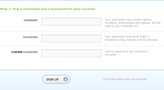
Many forms offer validation after users have committed an error. You can significantly reduce the amount of errors by offering helpful hints before the users starts filling out the form. Many forms offer hints through labels that describe the information the user needs to enter.
Another common hint is an asterisk symbol for text-based hints that tells the users about mandatory fields. You could use these suitably and add hints on how users should format the information; for e.g., information about the characters that can be used in passwords. Ensure that the hints are clearly visible and the number of common form-filling errors will reduce significantly. Needless to say, this will improve your conversion rates.
2. Use Dynamic Hints: Clean Look, Clear Purpose

Sometimes, it is not easy for users to understand the labels, and they do not know what information they need to fill in the fields. One way you can create a better form is by providing hints on the sides of the fields. But, this can make the form look cluttered and forbidding to the users.
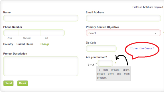
To get around this problem, you can use dynamic hints. You can make the hint appear as a tooltip when the user hovers the mouse on a small help button next to the field. If you don’t like the idea of a help button, you can make the tooltip hint appear whenever the user begins to enter the data, or when he hovers the cursor over the field. By assisting the user in this fashion, you provide unobtrusive assistance to the user and simplify the task of filling the form.
3. Respect Variation: Offer Enough Options

One of the ways designers make it easy for the users to fill forms quickly is by providing options. All the visitor needs to do is to click in the box near the relevant field. However, if you do not offer enough options, the users may get exasperated.
Every form has the simple question that asks the user to select the gender. Most forms offer only male and female as options. This makes it impossible for the millions of transgender people around the world to fill forms truthfully. More commonly, there are several forms that recognize only US, UK and Europe street addresses. Users living in other parts of the world just can’t fill such forms.
Does your site lack variations in web forms? Imagine the number of visitors you may be losing because of it. It is good if you give options to the users to choose from – it surely saves time – but you need to make sure that you are not stonewalling a lot of people due to lack of variation in the choices.
Easy to Fill Web Form Equals Better Web Conversions
By using the above tips for validating your web forms, you can improve the effectiveness of your web design. The form is usually the last step before the visitor purchases or subscribes your products or services. By making it the simplest step, you ensure that you don’t turn away someone who has walked a lot of distance to reach your doorstep.


