A Showcase of Typography in Business Card Design
A business card needs to make an impact. It acts like a small piece of marketing material, introducing the company and its representative to potential clients and customers, people who may collaborate on work or someone who can help the business grow. It needs to tell these people that the company is vibrant, growing and worth knowing about, so the design of a business card is in many ways as important as the actual information conveyed on it.
Many companies and individuals are turning to typography to make a real statement with their business cards. Typography specifically refers to the placement and printing technique of letters on paper, but it has come to refer more generally to using letters to make a design statement, instead of using illustrations. As demonstrated below, a business card that relies more on typography has a visual impact on the person looking at it, making it memorable whilst keeping the focus on the information.
Classic typography on business cards
The following five examples use straight forward typography to make a design statement. They vary in feeling from clean and direct to whimsical and charming, showing the range of feeling that typography can achieve.
Simple typography

This business card is about as simple and direct as it can get. The sans-serif font, set entirely in lower case, and lack of flourishes keeps things straight to the point. The business card gives the impression that this business (and the person who started it) is matter-of-fact and confident.

This card is not quite as simple. The pattern on the back of the card and the hyphen both give it some visual interest, though the information conveyed is still the dominant feature of the card. Interestingly, the name in bold is a phonetic spelling of the English instructor’s name, further emphasizing his expertise in English pronunciation and instruction without using any design elements apart from typography.

This card brings in colour to make its visual statement. It also has a very simple, monogram-like symbol for the company on the left. Still, the emphasis is still on the information, and it relies on the type to make the impact on the viewer.
Typography that has fun with fonts

Back when printing images was difficult and very expensive, many businesses like circuses and music halls would print flyers using typography to express a lot of information in an eye-catching way. This card reflects that, and though it expresses less information and is a smaller size, it still grabs the recipient’s attention and makes the company look like a lot of fun.

Although it is difficult to see the size of this card relative to other business cards, its dimensions are clearly unusual. This means it will be easy to find in even the thickest stack of cards, and its design means the holder of it will want to find it. Particularly interesting are the additional elements in the card: the back story and the interactive bit where the card holder can track the progress of their project.

This card shows exactly how much fun one can have with creative typography. It really speaks for itself.
Introducing other design elements
Typography doesn’t mean having to stick solely to types and fonts. Other design elements can be brought in to enhance the impact of the typography.

The pop-up design in the middle of this card has several great features: it gives the card an unusual size and shape when folded, making it easy to find; it sticks in the mind of the receiver; and it is interactive. It does most of the work, whilst the type subtly slips in the name and details of the company.

This card is simpler, having just one additional design element that draws the eye to the name of the company. That element, a neon green 60s inspired flower, contrasts so sharply with the traditional, sombre font, however, that it is impossible to ignore.

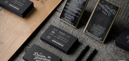
This card goes a step further than one additional design element. It uses four colours, a symbol and some design texture. Still, the text is laid out so simply and directly that the typography never gets swallowed up by the other parts of the design.

This card has just about every colour and graphic lines. But where the Oregonian card’s typography stands above all the design, this card’s typography merges into it. That is, it does not sit on top of the design, but becomes interwoven with the design. It is almost impossible to read all of the words jumbled together on the back of the card, and yet the words are all carefully lined up, sitting only one of two ways. The effect is a card that is both busy and yet oddly simple and very noticeable.
When it comes to design on a business card, impact and the ability to stick in people’s minds are crucial. As these cards demonstrate, typography can do that whilst demonstrating the tone of the company, be it seriousness, creativity, simplicity or fun.


Yes, great set you’re showing here ! As a web designer I often tell my clients typography IS deisgn !
Typeography is definetly design, whoever disagrees has no skills whatsoever with design or art for that matter. Typeography can change not only the design but also the way someone interpets the entire piece of work. You can really change the mood with it.
On the Big Frame it really reminds me of a typographical image on 8 bit Famicom or an NES console.
Typography looks more attractive in these business card!! All of these business card designs are amazing! Especially Sara Refflar car design!
Big Fame is really cool. Thanks for all the awesome business card inspiration!
I
really like that Grow business card design. It’s simple and the design elements
tie the whole concept together without going over the top. I like the way
you’ve broken these designs into categories. Nice work, Alex!