Minimalist Vs. Complex Websites
We are still facing the stupid conception that the creation and publishing of websites is a job for smart kids. The first decade of this millennium brings an end to this idea and the web design industry is born. Nowadays, despite a huge number of online presences, specialized people, who barely know the laws of beautiful design, create most of them. Even if the Internet was born almost twenty years ago, it’s a common and vital entity for the entire society. The irreplaceable advantages of it make our modern society to look carefully at the new “discovery” and to invest money and resources to have an impressive website. The web design is evolving and experts create awesome pieces of work, offering a large variety of styles, some of these very complicated while others are quite simple. A trendy direction is to create more and more simpler designs with a strong message. This trend is called minimalism, it’s also present in art and other adjacent domains and definitely it will never be old fashion. The main idea behind it is that sometimes “less is more”.
Another common type of layouts is the one of complex websites, heavily relied on a very complicated structure. These are probably more numerous as this is the default format of a layout. Apparently, minimalism and complex structures are opposite, but in fact, these are adaptations of the web layouts to better suit specific audiences. The minimalist influences can’t work for some types of websites so any web designer should think twice before creating and publishing one. I will give you examples of where a minimalist design may work and please share your ideas with us by using the comment forum.
1. You have a brief and concise message
A professional minimalist website can’t offer considerable text information as it must be simple and concise. Once you consulted the inspirational list below, you will quickly notice that the conventional three column structure is replaced by a few words, using large font format. Usually, the typography is the one who makes people click and launch such a website. Having a lot of text is in discordance with the idea of simplicity and in this case, the website is an awful amalgam. In a nutshell, the layout of a minimalist website can’t be made up with a long text area.
2. A modern and unconventional website
It’s obvious that a minimalist website scores high when it comes to originality and when is required to render an unconventional message it is the best option. Be honest, once you launch a website you expect to receive the information at hand but mostly you scan the webpage. The huge psychological difference about a minimalist website is that it stimulates your curiosity; this type of design is mostly suggesting and not informing. A web designer must see it as an unbounded project but emphasizing the basic message.
3. You don’t have a large palette of offers
Another suitable opportunity to create a minimalist website is the situation when the services or the offer of the website owner may be resumed in few words. This is the case of a portfolio for example. A minimalist website is regarded as a professional work because there is no attempt to persuade anyone, the visitors should enjoy the online presence. It may be considered that here, with no doubt, the quality is high and the clients know this.
On the other hand, it isn’t difficult to find situations when a minimalist concept is a wrong solution. Below I will present three major situations when a complex website, full of information is welcomed but be sure, there are many other cases where a minimalist approach isn’t suitable.
1. A large offer which needs a complete presentation
There is only a small obstacle in selecting the type of a website design – your imagination. So, if you are a web designer, before working on the .psd file of the website project, is better to imagine the layout in your head or draw it on a paper. Can you imagine something complicated which needs a well-structured text conveyed in a brief and concise format? It’s hard to imagine if not impossible…
Keep in mind: no one can exactly predict if a website may be minimalist or not but imagination and experience are good “friends” capable of giving good pieces of advice.
2. The website is official and serious
It’s too risky to create an unconventional website for an official and serious client and experts recommend avoidance of “too courageous” approaches. A serious company is building a brand and all actions are according to a plan that must be carefully followed. If this plan suggests a serious and conventional approach then it’s better to create a website in this direction.
3. A considerable navigational menu
It is not necessary but a complex navigational menu needs a complex website and it is better to avoid a minimalist strategy when you have many opportunities for the visitors.
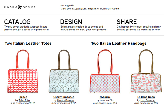
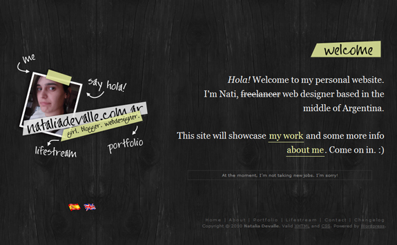
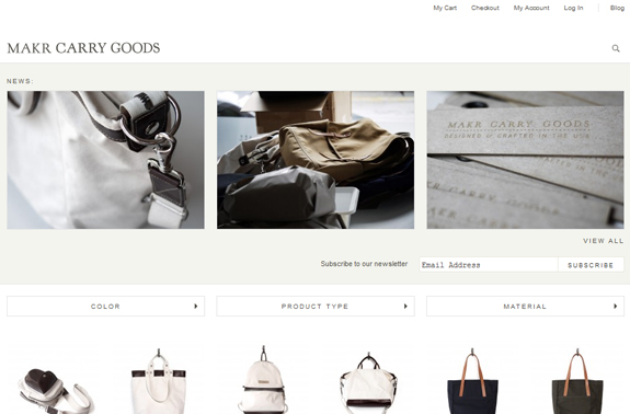
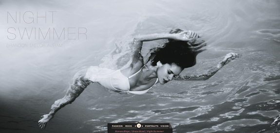
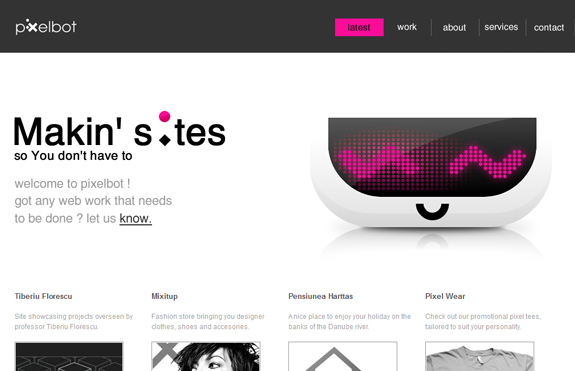
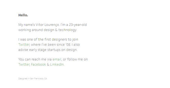
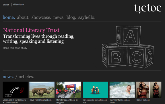
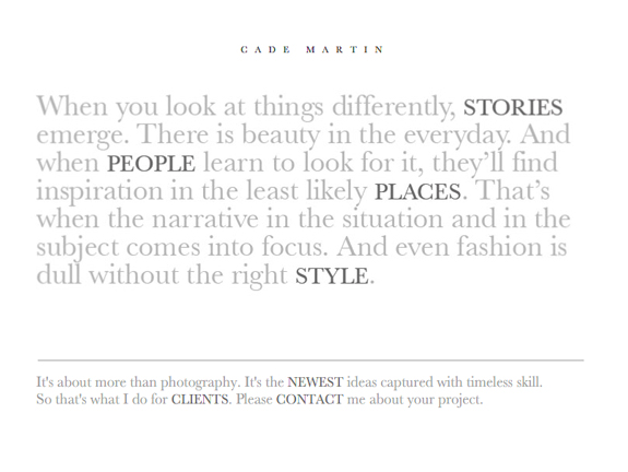
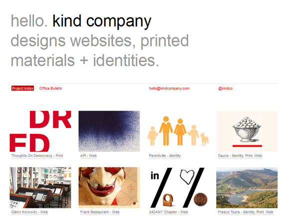
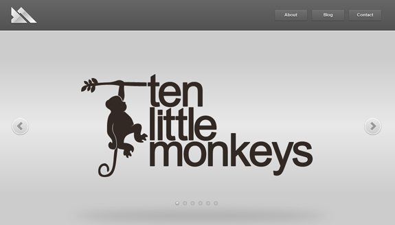
The websites below are examples of great simplicity and you can get a lot of inspiration from here. Enjoy them!


