Mastering The Basics Of Success In Minimalist Web Design
The more, the better. Nope. Not always, of course. Sometimes, we love simplicity over excess and from this weird human psychology, born a new concept, code named – Minimalist. It is like removing excess to make things simple and this is probably the most talked about trend in the web design industry. No more glossy buttons, overdose of images, over the top use of graphics and the list thus goes on.
As its name indicates, minimalism in web design denotes site design with only essential elements and leaving out anything that is unnecessary. However, for a web designer achieving success in minimalist website design may be a tad hard. A minimalist web site should have essential content and visual elements in it to reach out to users and achieve its goal. To succeed in minimalist web design, a web design professional needs to focus on some basic aspects.
Focus on subject
A web designer needs to design websites in a way so that it keeps target users hooked and prompts them to read content or buy services, depending on the nature of the website.
User friendliness
A minimalist website should be developed to facilitate user friendliness. A web designer need to use those design elements that enhance ease of use and discard those users can feel burdened with.
Visual symmetry
The website should have a fair balance of content, graphics and white space in it.
Reasons to switch to minimalism
Using minimalism in web design is ideal for staying focused to user needs in a way. A web designer may feel tempted to use his design skills and coding expertise in a website but the result may not be suitable for all users. A beautifully designed, media rich website may look nice on a PC but what about those mobile users who are still stuck with slower network speed? Using unnecessary elements in a website adds to the loading time and eventually irritates a section of web users. The last thing web users want is waiting for a site to load! On the contrary, a website designed with essential content and elements load faster, thus reaching out to maximum number of users.
There is an age old saying- ‘first impression is often the last impression’ and it holds true for web design as well. A website with a plethora of visual elements may look cluttered on devices with small screens and resolutions. What is the use of keeping many visual elements in a webpage if it does not look aesthetic to end users? Minimalist web design does away with site clutter and makes a site visually pleasing. A website with neat and balanced design also appears to be more professional to users.
Another obvious benefit of using minimalism in web design is less chances of running into code errors and bugs. When a web designer sticks to using basic codes and scripting in a website, finding code errors and fixing them becomes easier and less time consuming for him.
Using minimalism with a reason
While using minimalism in web design has some obvious benefits for both web designers and users, it is important to ensure that it is being applied with a solid reason. If a web designer switches to minimalism without understanding its purpose well, chances are neither his clients nor target users would be pleased with the outcome.
It is important to remember that in minimalist web design, a web designer may need to use elements which would not be required otherwise at times. Animation may not be essential in designing a corporate site, but it can turn out to be the prerequisite for making a kid centric website. Same can be said about flash videos.
Minimalism in web design should not be adapted in a way that it leaves the user confused. If a website turns out to be baffling for users or they find its navigation cumbersome owing to minimalist design approach, then it could be counterproductive.
Basics of minimalist web design
While minimalist design strategy for making websites does not follow any hard and fast rule, a web designer should adhere to some basic design principles for hitting the bull’s eye.
Pay attention to every detail
When you use fewer elements in a website, small flaws can become prominent to viewers. That is why web designers need to design minimalistic websites with pixel precise accuracy and check for symmetry anomalies. Everything from image placement to paragraph headline size matters in this regard.
Using Color with restraint
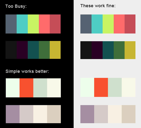
For succeeding in minimalist web design, a design professional should be careful about using colors in his websites. However, that does not mean using only gray or black will appeal to the users at all times! It is okay to use deep shades as long as they make the website appear neat and contrast well with other colors used in it.
White space matters
Using white space effectively in web pages is of paramount importance in minimalist web design. It helps in drawing user’s attention to content and graphics. A web site should have the right balance of white space, content and visuals to appeal to users.

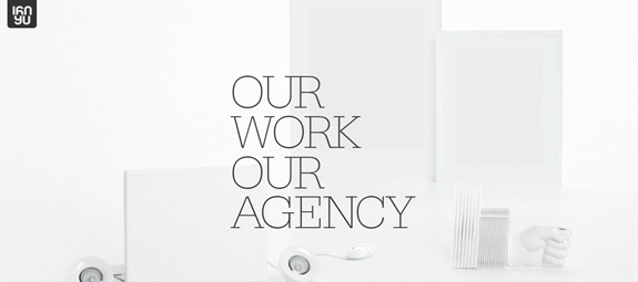

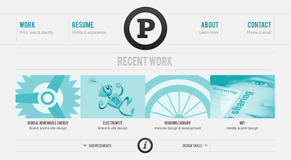
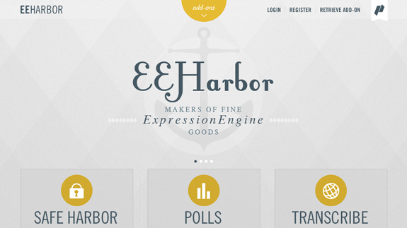


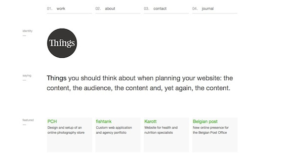

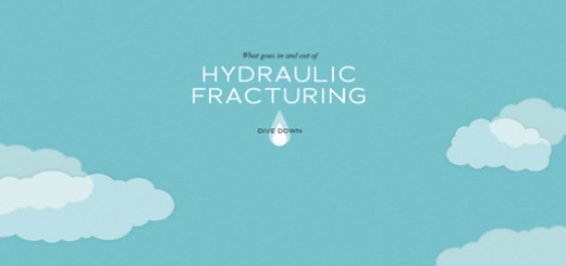


These web designs totally amazing!! Unique and attractive designs,
Really interesting article.Minimalist design page gives one less clutter, less
confusion for the viewers and makes this site easier on the design management
on codes.Thanks for sharing.