An Unconventional Guide of Selecting the Colors
It’s a great frustration for any designer to create a masterpiece that solicited all his skills, energy,time and, at the end, the client to be totally disappointed by it. In some cases is the subjectivity (yep, you may read cattiness if you want) of the client but sometimes is about a huge mistake that wasn’t remarked. One of the most problematic decisions of a designer is the selection of the proper color, much more there are very few projects that use a single nuance, the huge majority of them need a good color scheme formed from more than two colors.
Despite the number of colors is almost infinite, the good combinations of them are limited and it’s a great challenge to find the successful one for each project. The combination of colors should be created on two major factors, one being objective that is based on the laws of beautiful design and one more subjective and difficult to handle, the preferences of the clients. Besides that, another entity really decides which is good and which is decent, the users that see and interact with the project designed. The immediate issue of this fact is obvious, how to satisfy the taste of various people, perhaps some of them are based on various continents?
The bad news is that, no matter how skilled someone is and how much effort is invested in a single design, there will be people that won’t appreciate it and the same judgment is applied when dealing with colors. I use a simple, but very useful, method to make the best matching of colors, I try to associate each color used with a specific human type. Much simple, each color is a man, i.e. I need to do a website for an environmental company I try to imagine first the prototype of the persons who will visit it; the great majority of them are in love with green, the color of nature. In my mind green is a young individual very interested in the future of the humankind. Anyway, the main idea is that each color must be matched to the profile of the average user. Here I presented my own associations for the most common colors, I really hope to be useful for you and don’t be afraid to share with us your impressions. Please let me know your opinion therefore the comment form is for you!
1.White – calm, balanced, pure, simple
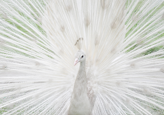
In my representation, white is a very calm person that tries not to hurt anyone and doesn’t want to be associated with violent actions. He is balanced, all the decisions are made according to a fine and correct judgment. The paradox of white is the fact that it may be used as a neutral solution (you noticed that the majority of the images are presented on a white background) but in the same time, it instantly attracts the eyes. The white is the kind of person that is pure but likes the luxury. In conclusion, white is the perfect solution when is required discretion & simplicity and is used as background or is predominant on websites that highlight the content. Many websites selling jewelry or luxury products use white, keep in mind for your next projects.
2.Black – mysterious, rich, demonic, elegant

The black is a very complex “person” having many facets. The black is instantly connected with mystery; the night darkness is eloquent for it. In the same time, a black dressed individual is usually elegant, mature and many times is catalogued as being rich. Unfortunately, the black has also negative aspects, for some people it’s demonic and is associated with occultism, sorcery or spiritism. I recommend using black in the same situations as the white but when is about purity, black isn’t suitable, it is better to express maturity, richness, experience and seriousness.
3.Blue – fair, devoted, loved
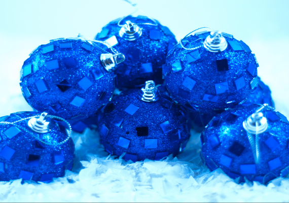
The prototype of individual liking blue is characterized by popularity, correctitude, and fair play. Blue is the most loved color hence it shouldn’t be a surprise why so many websites are build on blue and various nuances of it. Being common, it symbolize the best features of human people, devotion, charisma, and reliability. All these features are vital for financial and banking institutions and it’s simply to observe that the official online presences insert many bluish elements.
4.Red-passionate, courageous, ready for action
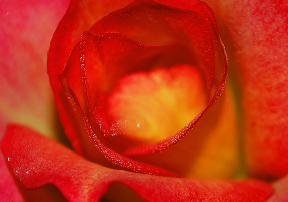
I consider red as a “person” that is very active; he never rests and is always ready to do courageous things, not available to the ordinary ones. Definitely red is for love and passion, there can’t be conceived a Valentine’s day without reddish gifts and hearts. The web designers know all these and the huge majority of the call-to-actions buttons are reddish, just because it expresses the best the wish for action.
5.Green – nature lover, fresh, young
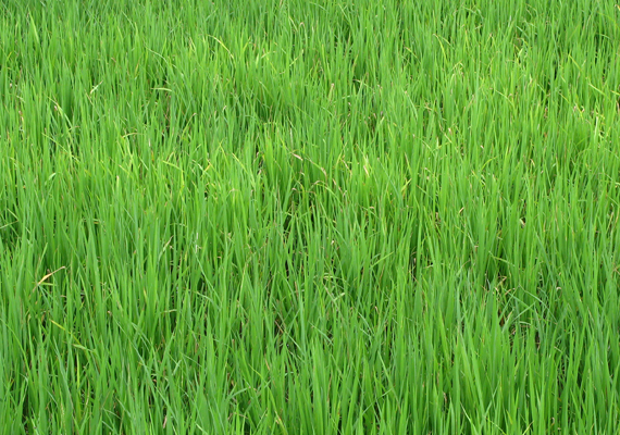
About green and his features was presented into the beginning of the post and it’s impossible to not take into the account the connection of the color with the environment and nature. The eternal green nuances of the conifers influenced us to consider this color as a never-ending source of freshness.
6.Yellow –cheerful, communicative, nice presence
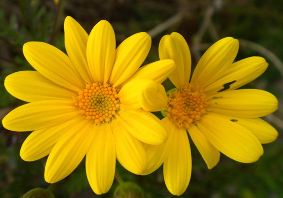
Pacman is the name of a famous game but in the same time, it’s the name of the “online midget,” a cheerful personalized sphere that is conducted by the user. The color of the Pacman was, as you probably guessed, yellow. The person associated to yellow is jovial, cheerful, and helpful. The studies demonstrated that yellow is stimulating the mental activity and consequentially use it when you want to present a difficult to understand topic or to communicate something important.
Do you agree with this cataloging or you have another system of reference? How do you select the colors for your projects?

